A/B testing of your online donation forms can be a powerful practice for optimizing their performance and maximizing the funds your nonprofit raises online. Analyzing relative conversion rates for your A/B tests within a tool like Google Analytics is just the beginning of the insights you can gain in your A/B tests, though. By integrating your A/B test with the Salesforce Nonprofit Success Pack, you can move beyond simple conversion analysis and compare performance across a host of metrics.
In this step-by-step recipe, we'll create a report and dashboards in Salesforce that will allow you to quickly see which form in your A/B test is performing best with respect to new vs. existing donors. For more background, a host of other metrics, and specifics on the A/B testing process, watch our webinar, Six Ways to Get Smarter with Your 2018 Fundraising.
Objective
Create a custom Report in the Salesforce Nonprofit Success Pack that compares online donation form A/B test results for new and existing donors
Estimated Time
30 - 45 minutes
Requirements
- Salesforce Nonprofit Success Pack
- Use of the Donations (aka Opportunities) object to track donations
- Use of an online donation service that allows for the creation of multiple donation pages and associate each with a Campaign in Salesforce. Learn more >>
- Use of Campaign Hierarchies to organize A/B testing Campaigns Learn more >>
- Use of Google Analytics or a similar service for the creation of Experiments to setup the A/B test online. Learn more >>
- Rudimentary familiarity with creating custom fields and Reports in Salesforce
- Is First Gift Ever custom field outlined in Step One of Chart New Donor Acquisition Cumulatively by Month during the Last 5 Years Salesforce how-to recipe
Desired Outcomes
Easily view and compare the performance of individual online donation forms in an A/B test across different metrics. This how-to focuses on leveraging Campaigns to measure how well a slight modification in a donation form brought in new and existing donors.
The End Result


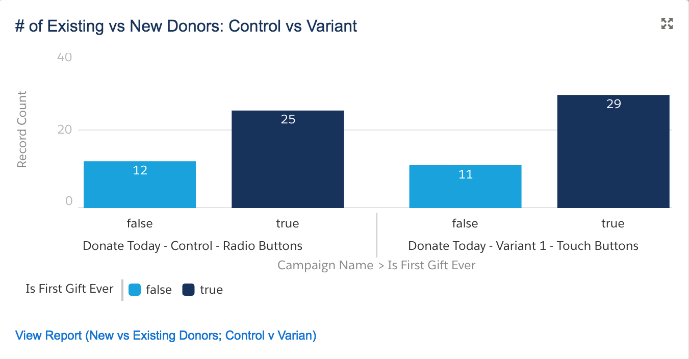
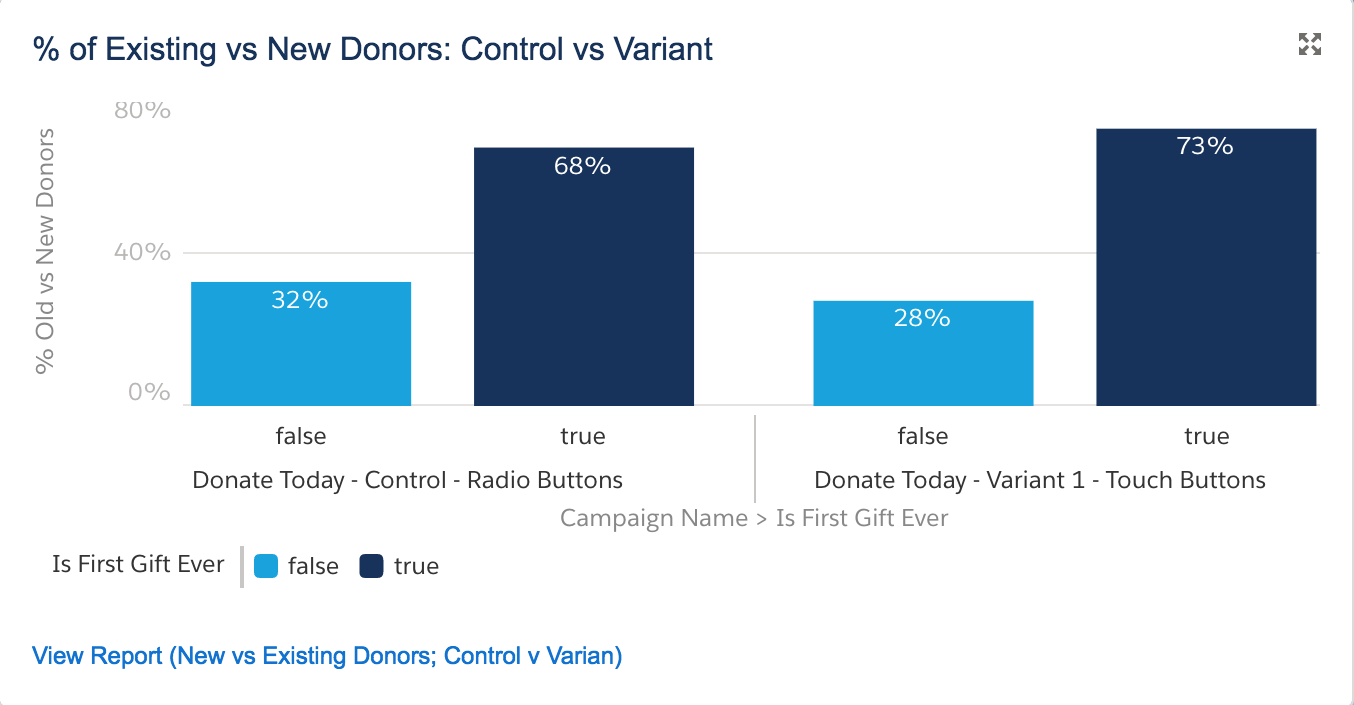
The charts above are based on one Custom Report of the Report Type "Campaigns with Opportunities." Depending on the chart, the light blue bar shows either the number or percentage of existing donors per campaign. The dark blue bar shows either the number or percentage of new donors per campaign. One campaign represents the original (control) donation form and the other campaign represents the slightly modified (variant) donation form.
These charts clearly show that the slight modification in the variant donation form brought in more new donors and less existing donors than the control donation form, suggesting that the slight modification in the variant donation form could be effective in bringing in new donors but not as effective in bringing in existing donors. An A/B test involving hundreds or thousands of visitors would more accurately show which version of a form performs better in reality.
{loadposition blog-ad-general}Step One: Create a Custom Report
The Custom Report with the chart we want needs to include all closed/won Opportunities from new and existing donors in each Campaign in an A/B test. To Create our Report:
- Go to the Reports tab
- Click New Report
- For Select Report Type, choose Campaigns with Opportunities
- Click Create
- For Show, confirm "All Opportunities" is selected
- For Date Field > Range, select "All Time"
- Click Add next to Filters. In the new Filter form that appears:
- Choose "Won" from the field drop down
- Select "Equals" for the operator
- Enter "True" in the text field
- Click Add next to Filters again:
- Choose Parent Campaign Name from the field drop down
- Select Equals for the operator
- Enter the name of the parent campaign containing each sub-campaign in your A/B test.
- Click OK
- Next to the Preview Header, click Summary Format
- Drag and drop the Campaign Name field to where it says "Drop a field here to create a grouping"
- Drag and drop the Is First Gift Ever custom field to where it says "Drop a field here to create a grouping" in the area right below the Campaign Name grouping.
- Click Save and enter in the following values in the popup window
- Report Name: New vs Existing Donors: Control vs Variant
- Report Unique Name: New_vs_Existing_Donors_ Control_vs_Variant
- Report Description: Number and percentage of new and existing donors per Campaign
- For report Folder, select the folder of your choice
- Click Save
Step Two: Change your report to a Matrix Report and add in some trimmings
- Next to the Preview header, click Summary Format and Select Matrix
- Ensure that the "Is First Gift Ever" and the Campaign Name fields are grouped in each axis of the matrix.
- Drag and Drop Add Formula to where it says "Drop Summarizable fields into the matrix."
- In the Custom Summary Formula Field popup, enter the values noted in the Report Formula Field table below.
- Click OK
- Click Save
| Elements | Field Details |
|---|---|
| Column Name: Description: Format: Where will...?: Formula: |
% Existing vs New Donors Percentage of existing and new donors per Campaign Percent, 2 Decimals At a specific row/column grouping level... A: Campaign Name B: Is First Gift Ever RowCount / PARENTGROUPVAL ( RowCount, CAMPAIGN_NAME, COLUMN_GRAND_SUMMARY ) |
Step Three: Modify the Report's Chart
To create the chart noted above in Lightning, edit the default chart as follows:
- Select Type: Vertical Bar Chart
- Y-Axis: % Existing vs New Donors
- X-Axis: Campaign Name
- Group By: Is First Gift Ever
- Formatting > Chart Title: Existing vs New Donors
- Click OK
- Click Run Report
The chart displayed should parallel the chart above to show the percentage of existing and new Donors in each A/B Test Campaign. To view the number as opposed to percentage of new and old donors, simply change the Y-Axis value to Record Count.
Next Steps
For more background on this recipe, specifics on the A/B testing process, examples of what to test, and an overview of UTM codes for inbound marketing metrics, watch our webinar, Six Ways to Get Smarter with Your 2018 Fundraising.
Supporting Resources
- WEBINAR RECORDING: Six Ways to Get Smarter with Your 2018 Fundraising
- BLOG POST: Six Ways to Get Smarter with Your 2018 Fundraising
- SALESFORCE HOW-TO BLOG POST: Track Online Donation Form A/B Test Results with Salesforce Campaign Hierarchies
- SALESFORCE HOW-TO BLOG POST: Create a Salesforce Report to Evaluate A/B Tests of Online Donation Forms for One-Time and Sustaining Donations
- SALESFORCE HOW-TO BLOG POST: Create a Salesforce Report to Evaluate A/B Tests of Online Donation Forms for New and Existing Donors
- SALESFORCE HOW-TO BLOG POST: Create a Salesforce Dashboard to Display A/B Test Results of Online Donation Forms

