
In our previous two blog posts here and here, we provided step-by-step instructions for creating reports in the Salesforce Nonprofit Success Pack to evaluate the effectiveness of A/B tests of your online donation forms. For this recipe, we wrangle all twelve metrics onto a single dashboard so you can easily compare the performance of each form in the test.
For more background on this recipe, specifics on the A/B testing process, examples of what to test, and an overview of UTM codes for inbound marketing metrics, watch our webinar, Six Ways to Get Smarter with Your 2018 Fundraising.
Objective
Create a Dashboard in Salesforce with charts that display the results of A/B test Campaigns across twelve key metrics
Estimated Time
30 - 45 minutes
Requirements
- Salesforce Nonprofit Success Pack
- Use of the Donations (aka Opportunities) objects to track donations
- Rudimentary familiarity with creating custom fields and Reports in Salesforce
- One-time vs Recurring Donations: Control vs Variant custom report outlined in Create a Salesforce Report to Evaluate A/B Tests of Online Donation Forms for One-Time and Sustaining Donations Salesforce how-to recipe
- New vs Existing Donors: Control vs Variant custom report outlined in Create a Salesforce Report to Evaluate A/B Tests of Online Donation Forms for New and Existing Donors Salesforce how-to recipe
Desired Outcomes
Display one-time donations, recurring donations, and donations from new donors and existing donors across various metrics within an A/B test Campaign to easily evaluate test results.
The End Result
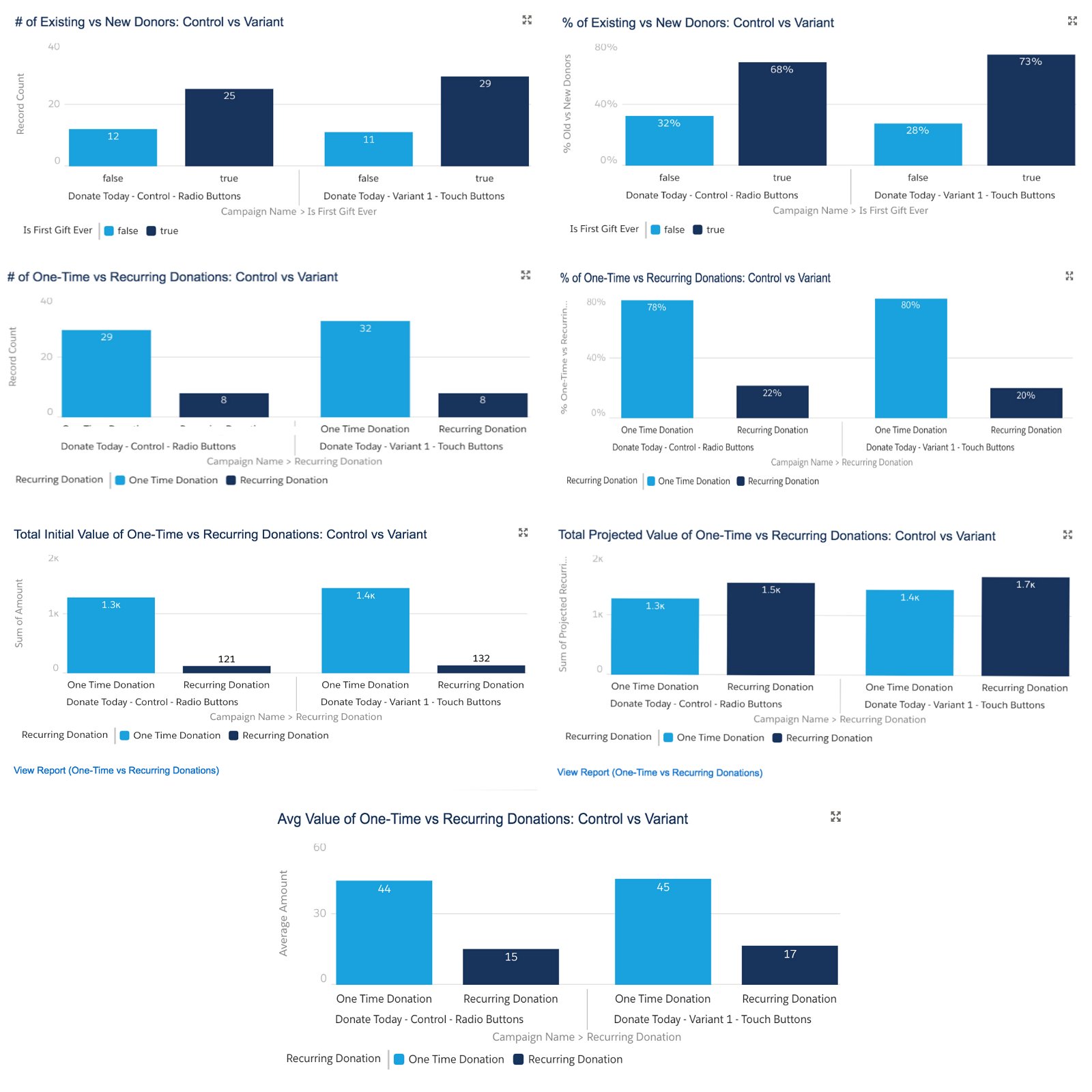
Step One: Create a Dashboard and display the number and percentage of new and existing donors in a A/B Test Campaign
With a report created in our previous how-to recipe, we can now create a Component to display the number of new and existing donors in our A/B Test Campaign.
- Go to the Dashboards tab in Salesforce Lightning and click "New Dashboard"
- In the popup window, enter a name, description and folder, then click Create
- Click the add Component button
- Select a report to base the Component on. We will select "New vs Existing Donors: Control vs Variant:
- Enter the values below in the popup window:
- Select the Vertical Bar Chart Component
- 1st X-Axis: Campaign Name
- 2nd X-Axis: Is First Gift Ever
- Y-Axis: Record Count
- Check box for Show Values
- Sort Rows By: Label Ascending
- Max Groups Displayed: 100
- Title: # of Existing and New Donors: Control vs Variant
- Legend Position: Bottom
- Click Add. You should be able to see the chart below.
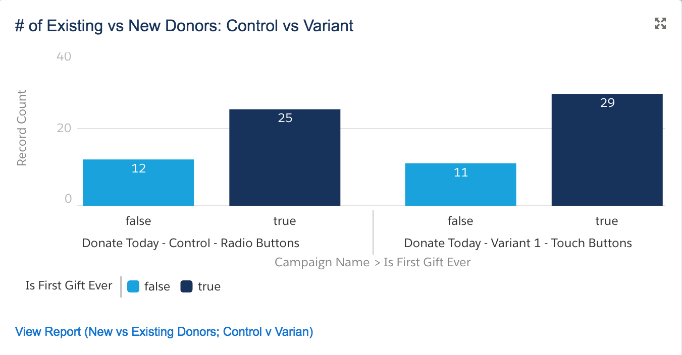
To add another chart showing the percentage rather than number of new and existing donors per campaign, follow the same steps you took in making the chart above, starting from clicking the add Component button. We are only changing:
- Y-Axis: % Existing vs New Donors
- Title: % of Existing and New Donors: Control vs Variant
You should be able to see the chart below:
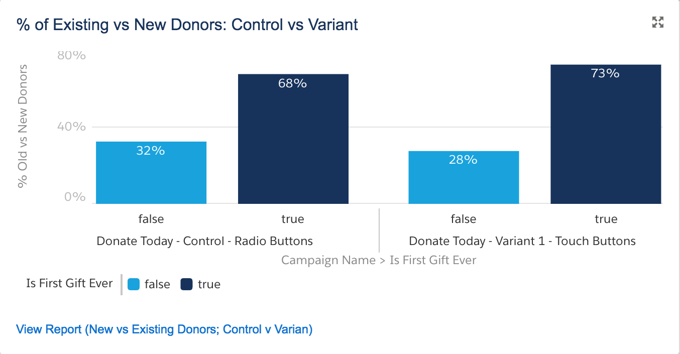
Step Two: Display the number and percentage of one-time and recurring Donations in a A/B Test Campaign
With a report created in our previous how-to recipe, we can create a Component to display the number of one-time and recurring donors in our A/B Test Campaign.
- Go to the Dashboards tab in Salesforce Lightning and click "New Dashboard"
- In the popup window, enter a name, description and folder, then click Create
- Click the add Component button
- Select a report to base the Component on. We will select "One-time vs Recurring Donations: Control vs Variant"
- Enter the values below in the popup windows
- Select the Vertical Bar Chart Component
- 1st X-Axis: Campaign Name
- 2nd X-Axis: Recurring donation
- Y-Axis: Record Count
- Check box for Show Values
- Sort Rows By: Label Ascending
- Max Groups Displayed: 100
- Title: # of One-time and Recurring Donations: Control vs Variant
- Legend Position: Bottom
- Click Add. You should be able to see the chart below.
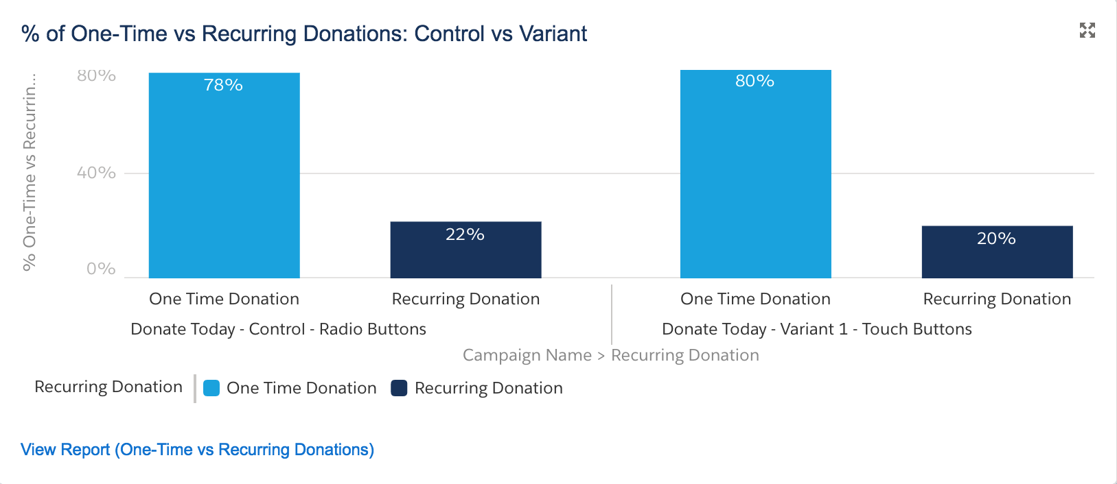
To add the second chart showing the percentage rather than number of one-time and recurring donations per campaign, follow the same steps you took in making the chart above, starting from clicking the add Component button. We are only changing:
- Y-Axis: % One-time vs Recurring Donations
- Title: % of One-time vs Recurring Donations: Control vs Variant
You should be able to see the chart below:
Step Three: Display the initial, projected, and average value of one-time and recurring donations in a A/B Test Campaign
With a report created in our previous how-to recipe, we can create a Component to display the initial, projected, and average value of one-time and recurring donations in our A/B Test Campaign.
- Go to the Dashboards tab in Salesforce Lightning and click "New Dashboard"
- In the popup window, enter a name, description and folder, then click Create
- Click the add Component button
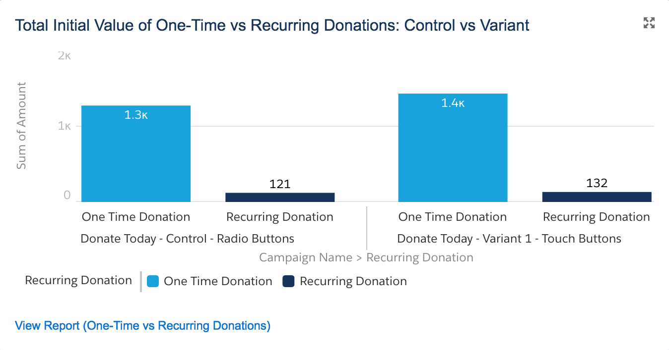
- Select a report to base the Component on. We will select "One-time vs Recurring Donations: Control vs Variant"
- Enter the values below in the popup window:
- Select the Vertical Bar Chart Component
- 1st X-Axis: Campaign Name
- 2nd X-Axis: Recurring Donation
- Y-Axis: Sum of Amount
- Check box for Show Values
- Sort Rows By: Label Ascending
- Max Groups Displayed: 100
- Title: Total Initial Value of One-time and Recurring Donations: Control vs Variant
- Legend Position: Bottom
- Click Add. You should be able to see the chart below.
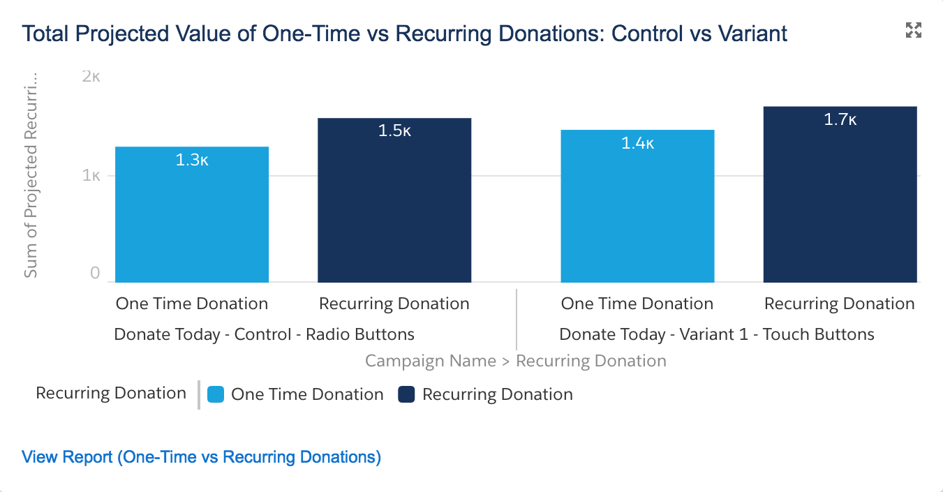
To add the second chart showing the total projected value of one-time and recurring donations per campaign (factoring in recurring donation records not yet received but pledged in the future) follow the same steps you took in making the chart above, starting from clicking the add Component button. We are only changing:
- Y-Axis: Sum of Projected Donation Amount
- Title: Total Projected value of One-time and Recurring Donations: Control vs Variant
You should be able to see the chart below:
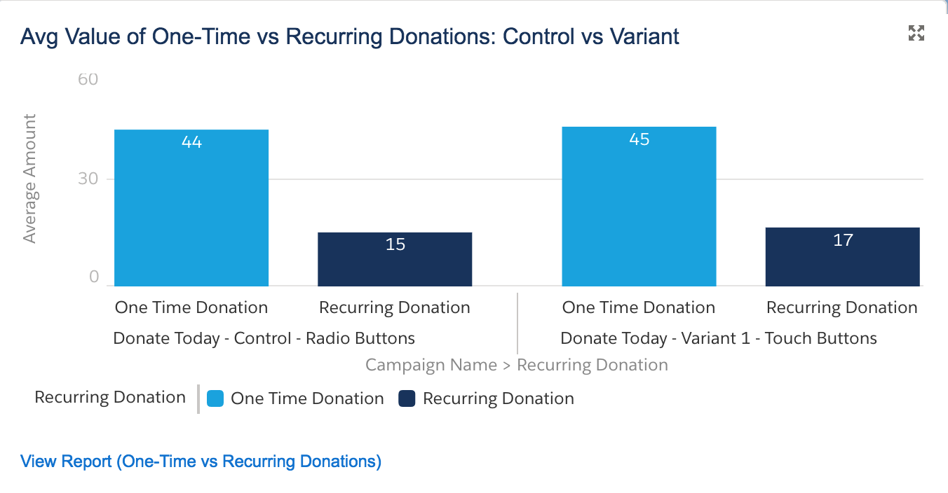
To add the third chart showing the average value of one-time and recurring donations per campaign, follow the same steps you took in making the chart above, starting from clicking the add Component button. We are only changing:
- Y-Axis: Average Amount
- Title: Avg Amount of One-time and Recurring Donations: Control vs Variant
You should be able to see the chart below:
Next Steps
For more background on this recipe, specifics on the A/B testing process, examples of what to test, and an overview of UTM codes for inbound marketing metrics, watch our webinar, Six Ways to Get Smarter with Your 2018 Fundraising.
Supporting Resources
- WEBINAR RECORDING: Six Ways to Get Smarter with Your 2018 Fundraising
- BLOG POST: Six Ways to Get Smarter with Your 2018 Fundraising
- SALESFORCE HOW-TO BLOG POST: Track Online Donation Form A/B Test Results with Salesforce Campaign Hierarchies
- SALESFORCE HOW-TO BLOG POST: Create a Salesforce Report to Evaluate A/B Tests of Online Donation Forms for One-Time and Sustaining Donations
- SALESFORCE HOW-TO BLOG POST: Create a Salesforce Report to Evaluate A/B Tests of Online Donation Forms for New and Existing Donors
- SALESFORCE HOW-TO BLOG POST: Create a Salesforce Dashboard to Display A/B Test Results of Online Donation Forms