
How amazing would it be if your donors saw a color or an image and immediately thought of your organization or mission? That is successful branding at work.
When we think of Nike we picture award winning athletics, professionalism in sport, determination to succeed, a trusted company with trusted products- and of course, we picture the Swoosh™. This is a brand. It is consistency in marketing a company identity.
Branding isn’t something only large corporations and big name nonprofits can have. In fact, we’re here to let you know that not only is developing a trusted brand possible for your nonprofit, it’s necessary!
But, don’t worry! You don’t need to have all the resources of Nike to make this happen. We’ve got some tips to help you develop a branding strategy for your nonprofit.
Table of Contents
4 Thoughts on How to Develop Your Nonprofit Branding Strategy
Putting It All Together: Two Nonprofit Branding Examples
What Is Branding and Why Is it Important for Nonprofits?
A brand is a comprehensive and intentional display of the identity and mission of your nonprofit. It’s a combination of your core mission, principles, your work, and your relationships, and your legacy.
Studies show that using “consistent branding across all channels increases revenue by 23%”. Over half (60%) of millennials expect some kind of branding, and 91% of consumers prefer to support companies with recognizable branding.
What does this mean for you? Branding builds trust and rapport with donors. Trust and rapport means committed supporters, and that leads to more reliable fundraising.
Further, branding helps distinguish your nonprofit from the competition… which is especially helpful when making year-end mailers and other places you’re trying to stand out from the crowd!
6 Thoughts on How to Develop Your Nonprofit Branding Strategy
Like we said, you don’t need to have millions of dollars in your marketing budget or all the best advertising resources on the market to develop a branding strategy for your nonprofit. With just a few thoughtful, intentional steps, you can create a recognizable brand that builds trust with current and potential supporters and clearly communicates your mission.
1) Identify your values
Brands communicate more than just a logo or a jazzy color scheme. Going back to our Nike example, the Swoosh™ itself doesn’t really say anything about professionalism in athletics. It’s just an upward moving line. But professionalism in athletics is one of Nike’s values. So, before we get into logos and colors, let’s start with the foundational questions that will help you determine what values you want your brand to communicate.
Here are some questions to consider when you’re identifying your values:
- What do we do here? What is our mission and who does it help?
- Why is that important?
- What makes us different?
- What do we want people to think or feel about our organization? What are some of the qualities or values of our organization that we want people to receive from us? Some words that might fill this category are: warmth, compassion, accessible, supportive, professional, clinical, modern, pious, fun, trustworthy, etc.
- What tangible images express those feelings? Words, colors, pictures, or symbols.
- Who are those people we want to communicate those thoughts and emotions to?
- What matters to them? What moves them to action?
We highly suggest doing market research to tailor your brand to connect with your target donors. You should ask some of your donors these questions to learn how they view you now and how they’d like to view you in the future.
2) Color choice matters
Have you ever seen a political candidate’s ad in lime green and pink? That would be unusual because of the rule of appropriateness.
It turns out, viewers have predetermined expectations about what colors are appropriate for different attitudes and purposes. The best way to communicate with your potential donors is through the colors your mission relates to the best.
For example:
- Organizations with a conservative, established, professional, or traditional focus are better suited with muted or deeper colors like navy or burgundy.
- Child friendly nonprofits communicate most frequently with pastels or primary colors.
- In viewers’ minds, green is a more suitable choice for environmentally focused nonprofits than say, purple.
Surprisingly, there’s a lot of psychology behind colors and how we subconsciously interpret them. If you want more information on what different colors communicate, check out this guide on color theory.
3) What’s in a name? Naming conventions
When should your organization be referred to by its full name, and when are abbreviations or acronyms acceptable? Are you comfortable with someone abbreviating your nonprofit’s namesake? (And does that abbreviation spell something embarrassing or inappropriate?) Are there ways you don’t want to be named?
This would also be an appropriate time to come up with a tagline for your nonprofit organization. A tagline is a short, clear message that describes who you are or what you do. If your name is at all unclear towards what your mission is, a tagline can clear up any confusion in donors’ minds.
4) Symbols
Typography says something about the personality of your brand. Font selection, font colors, size, and even the space between the letters all communicates something when put together. This is where you broadcast the fun-loving or the professional attitude of your organization. We’ll go into more of this when we get to the examples.
Before we do so, let’s chat about logos for a moment. We spoke earlier about tangible symbols that display your organization’s mission. Most often people think of logos when they come to this category. Your logo (or brand mark) can be your nonprofit’s preferred image, its name, or both.
Whichever way you decide to go, logos don’t always have to be a clear example of what your nonprofit does. In fact, when you start to think about it, a lot of companies have built meaning into a symbol, just like Nike’s swooshing line.
If you’re branding for the first time or undergoing a re-brand, we recommend having more than one color design for your brand mark. Make sure one looks good on dark backgrounds and the other displays well on white or light colored backgrounds.
Additionally, some organizations have both a full-color logo for promotional use and a single color logo (such as black-and-white) for print use. This is optional, but very helpful.
Another thing to consider is all the different places you might want to put your logo--embroidered on shirts or other items of clothing, in a square image on your social media pages, printed in the upper corner of an envelope. Is your logo “diverse” enough to use in all these kinds of places?
We’ve laid a lot of groundwork on what goes into a brand, but how do we apply it? Let’s meet our examples!
Putting It All Together: Two Nonprofit Branding Examples
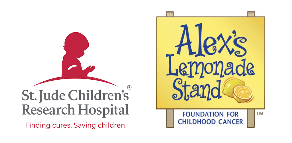
St. Jude Children’s Research Hospital
St. Jude Children’s Research Hospital is a professional, clinical, research and treatment facility for children. They want to communicate trustworthiness, professionalism, longevity, and the fact that they care for and about children. They do this in two ways:
First, they communicate professionalism and longevity with the grey serif font, capitalized letters, and even spacing of the two lines of text on top of each other. The choice of a more muted grey is more open and warm than a stark black, and even the red- while bright- is not a full fire-engine red.
However, just displaying trustworthiness and professionalism can come across cold and robotic. So to communicate their care of children, their brand mark is a child looking down to its hands in innocence.
They chose red to offset the grey and bring visual activity to the brand mark. Finally, they chose a sans-serif font which usually communicates modernity and forward thinking for their tagline which succinctly states what they’re doing: finding cures, saving children.
Alex’s Lemonade Stand
Alex’s Lemonade Stand started with a young child who wanted to find a cure to both her cancer and other children’s cancers. So she set up a lemonade stand in her front yard.
While their mission is similar to St. Jude’s, Alex’s Lemonade Stand wants to communicate trustworthiness, the childlike purity of helping others, and the determined desire of their founder to beat cancer. They do this in a few ways:
First, the colors are bright and primary (blue and yellow). Second, their logo underlines the roots of the foundation: a sign for a lemonade stand, and lemons (which as you know are arguably the most important ingredient to a successful lemonade stand). Third, their font choice is exaggerated in size, uneven, and the width of the letters varies, much like a young child’s handwriting. The whole logo has an attitude of lighthearted hope and positivity. It’s very childlike despite showing no clear picture of children.
However, the organization wants to be taken seriously in their mission to end cancer. So, in order to project the sobriety and the professionalism of the organization, they use an all-caps tagline that bluntly states who they are: a foundation for childhood cancer.
As you can see, many small choices come together to show the cohesive personality of a nonprofit in a brand. It’s not one thing that communicates who an organization is and what it does--it’s a host of small things that work together.
Using Your Nonprofit’s Brand Identity With A Guidelines Document
Congratulations! Your organization decided on a brand! This is a big step!
Ok, but now that you’ve got it, how do you use it? That is an excellent question!
Do you remember that statistic earlier that states revenue increases when consistent branding is present? The key to that sentence is the word consistent. You want everyone in your organization--not just your marketing or fundraising departments--to use your branding in the same way so that your organization looks consistent across all platforms.
Our suggestion (and the recommendation of most marketing experts) is to make a document that defines and explains all the ways the individual components of your brand should be displayed. Often, these documents will include not only the correct ways to display things like colors and brand marks, but also examples of what NOT to do with your branding and logo.
Some things to consider including in the document are:
- Your naming convention.
- Every way your logo can be displayed and when each variation should be used.
- Any additional symbols your organization can use to associate with your brand and when they may be used.
- Each font, color, and size to use in every form of publication.
- All your preferred colors (both primary and secondary color palettes).
- Ways your organization should talk about things (For example, are there words or phrases you want to embrace or avoid?).
For more in depth examples of brand guidelines, we recommend looking at the guideline documents for The Boy Scouts of America or Toastmasters International.
At this point, branding is all around us and it can seem like companies and nonprofits organically developed their brand over time, or have always had it. But in reality, a lot of time, resources, energy, research, and planning goes into effective branding. Both for profit and not for profit organizations make careful choices to reach their target audiences so they can grow.
Your goal is to grow your nonprofit, and our goal is to empower you! From sharing our thoughts on branding and marketing to giving you the tools you need to strengthen your nonprofit, Soapbox Engage is here to walk with you as you accomplish your mission.
Now that you’ve got the ball rolling on developing or upgrading your brand, here are three more resources to keep you growing your nonprofit.
- The Nonprofit Marketing Guide for Busy Fundraisers: Now that you’ve got your branding all set, it’s time to start putting it to work for your nonprofit! The internet is flooded with marketing strategies and quick tips to market your nonprofit. This blog has some easy and effective advice to help you put together a cohesive marketing guide--even for a shoestring budget!
- Surefire Ways To Improve Your Nonprofit Storytelling: Surprisingly, storytelling is an important part of branding and fundraising for any nonprofit. The best communicator you know is probably an excellent storyteller, able to help you imagine what something looks, feels, or even smells like! Your organization probably creates powerful potential stories through your work. Are you communicating these stories most effectively? This blog has some excellent insight into how you can become an impactful storyteller!
- 8 Proven Ways to Grow Your Nonprofit Email List: Email remains one of the most effective and affordable ways to communicate with a broad audience. This blog post includes eight proven ways you can grow your nonprofit’s email list so you can reach more current and potential donors and raise more money!