We commented earlier on the massive explosion of mobile internet use and how it is contributing to 2013 being the year of responsive web design - responsive web design being a powerful and flexible way to make your site mobile-friendly.
How do you know if your site traffic justifies the investment in making your website mobile-friendly? If you've got Google Analytics tracking traffic, you've got ready-made reporting waiting for you.

Accessing mobile traffic reports in Google Analytics
Login to your Google Analytics account, go to Audience in the left column, and click on Mobile. You'll see two options available to you: Overview and Devices.
Overview is at-a-glance gold, giving you the breakdown of mobile vs. non-mobile traffic, complete with stats on total visits during the reporting period, pages viewed per visit, average visit duration, percentage of new visits, and bounce rate.
Devices digs into the mobile side, showing you the same traffic breakdown by device type.
Analyzing mobile traffic reports
So, you've got the data. What exactly should you look for and how does it inform a decision? First, some context and then three questions.
The context: Comparing mobile to desktop traffic
The Visits column shows traffic totals from mobile ("Yes") and desktop ("No") devices. Do some quick math comparing the figures and you've got a handy percentage calculating the numeric significance of mobile traffic.
But, how significant is significant? That will depend on your audience, how they use their devices, and how you push your content out to them but it's worth tossing out some percentages as benchmarks for comparison:
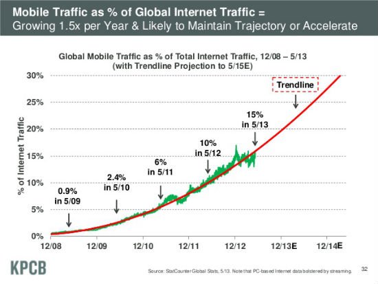
In May 2013, the KPCB Internet Trends 2013 report presented by internet maven Mary Meeker claimed that mobile has climbed to 15% of the total web traffic
A study by Walker Sands Communications found that 23 percent of total website visits in December 2012 derived from mobile devices. This data came from analyzing a dozen of Walker Sands U.S. based company clients.
To highlight how individual sites and audiences can perform differently than the average, Buzzfeed noted in April 2013 that 50% of Buzzfeed's traffic is coming from mobile devices.
You're likely not BuzzFeed but if you mobile percentage is significantly out of step with averages, it could be time to get mobile-friendly.
The questions
1) Are pages viewed by visit and total time per visit significantly different between mobile and desktop visitors?
If folks are investing fewer clicks and fewer seconds on your site when viewing it on a mobile devices, a mobile-makeover could be in order.
2) Are new visitors significantly higher for mobile than desktop?
This could be a great indicator that your own traffic trend line is matching averages across the internet with your own uptick in mobile views - and a good sign that its time to get mobile-friendly.
3) Are you using Facebook, Twitter, or mass email to push web content to visitors - but still see mobile traffic underperforming?
Users interact with social networks and email a lot on mobile devices. If you're pushing out regular updates over these mobile-friendly channels but still see your mobile traffic flagging across these various metrics, it's time to get serious about a mobile-friendly site.
Responsive design for mobile-friendly websites
Responsive design allows your website to adjust to various devices and resolutions, allowing visitors get the best user experience possible regardless of the device they’re using to view your site. In the words of Mashable that we cited earlier:
“For publishers, it offers the simplest way to reach readers across multiple devices. For users, it ensures a great experience on every screen.”
If you'd like to chat about how Soapbox can make your website responsive, hit us up!
[fundraising-newsletter-cta][/fundraising-newsletter-cta]
 Donations
 Events
 Petitions
 Forms
Forms Shop
Shop Directories